Best viewed on desktop
← Back
1 / 12
Scaled
Native
?
Scaled: fit to screen
Native: 1:1 pixels (sharpest)
Madd(y|ie)

Brand Guidelines

2025

The (y|ie) toggle

Concept

The Toggle

Naming things is hard. "Maddy" or "Maddie"? Both are valid, neither is wrong, and honestly who cares. So we made it a toggle. Pick whichever you want. Switch whenever.

It animates nicely. Satisfying to click. Gives us something to play with that isn't just "look, another gradient." The brand gets a built-in interactive element, which is more than most companies can say about their logo.

Oh and the brandmark? We flipped the LiMSight one upside down and gave it a new coat of paint. It kind of looks like a person with four arms now, so we're calling it "the people" to represent the company behind the product. Is that a stretch? Maybe. But here we are.

Design Inspiration

We had to use "Madd(y|ie)" in the logo. Have you tried setting that in display type? It looks terrible. And there's like three ways to represent "or" visually, like what, a literal OR gate? The toggle was basically the only option that didn't look bad and I guess design do be like that some times.

Logo

Clear Space

Maintain breathing room equal to the icon height on all sides. This ensures the logo remains legible and impactful.

Clear space diagram

The Icon

In Motion

Application

Approved Backgrounds

White

White

Light Gray

Light Gray

Aurora

Approved Light Gradients

Lavender

Lavender (PRIMARY)

Dark Lavender

Dark Lavender

Treated photo Treated

Treated Photos & Textures

Grid

Non-Distracting ELEMENTS

Dark Aurora

Approved Dark Gradients

Glass

Transparent Glass

Avoid

Secondaries

Secondary colors

Linear

Linear gradients

Photo Photo bg

Unedited photos

Gray

Distorted

Effects

Effects

Busy

Busy backgrounds

Wordmark alone

Wordmark alone

Wordmark Rearranged

Rearranged

Icon Wordmark

Mixed colors

Brand

Color Palette

Primary Use

Lavender is our workhorse. Use it for backgrounds, CTAs, buttons, links, and anywhere the brand needs to show up boldly.

Supporting Colors

Indigo, Blue, and Cyan appear in gradients, data viz, or adding visual variety. They complement Lavender, never compete with it.

Never Alone

Supporting colors shouldn't appear solo as backgrounds or primary action colors. They work best in gradients or as accents alongside Lavender.

OKLCH color space for perceptual uniformity. Brand colors at 54% lightness for consistent vibrancy across hues.

Lavender

Primary

#9854ff RGB 152, 84, 255 HSL 264° 100% 66% OKLCH 0.54 0.25 305

Indigo

Supporting

#5e42fe RGB 94, 66, 254 HSL 249° 99% 63% OKLCH 0.54 0.26 280

Blue

Supporting

#007dff RGB 0, 125, 255 HSL 211° 100% 50% OKLCH 0.54 0.20 255

Cyan

Supporting

#0891b2 RGB 8, 145, 178 HSL 192° 91% 36% OKLCH 0.54 0.15 210

Dark Lavender

Dark / Text

#201844 RGB 32, 24, 68 HSL 251° 48% 18% OKLCH 0.22 0.119 297

White

Background

#ffffff RGB 255, 255, 255 HSL 0° 0% 100% OKLCH 1.00 0.00 0

Color System

Shade Grid

Keep it simple. Primaries sit at 54% lightness - that's where AAA contrast lives on white. For hover states, +/- 4%.

OKLCH makes the full spectrum available if you need it. Same chroma, same hue, just slide the lightness. If you venture lighter, aim for at least AA contrast.

Dark Lavender plays by different rules - its base lives at 22%.

Lavender
Indigo
Blue
Cyan
54% Primary
Extended

Gradients

Atmosphere

We don't use hard linear gradients. Instead, brand colors become soft, blurred shapes that create depth and atmosphere.

Large blurred shapes at low opacity create an aurora-like effect. Circles, ovals, stretched blobs. Be creative with the forms, but keep them soft and diffused.

Use 2, 3, or 4 colors. There's no strict rule. Layer them, let them overlap and blend naturally. The key is subtlety and depth, not precision.

Properties

Shapes circles, ovals, blobs, lines, etc
Blur 80-150px
Opacity 8-15% (watch text)
Colors see brand palette

Shown Here

Lavender · 12% · 150px blur · circle
Cyan · 10% · 130px blur · circle
Indigo · 8% · 100px blur · circle

Artwork

Visual Language

Victorian cape illustration

Personal & Authentic
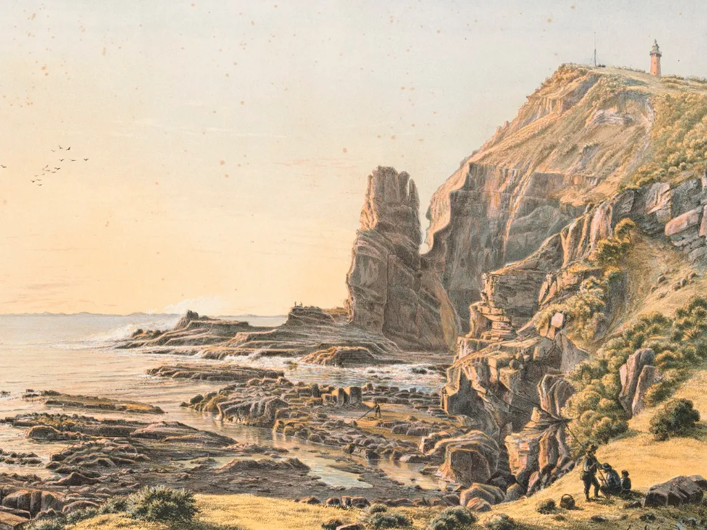
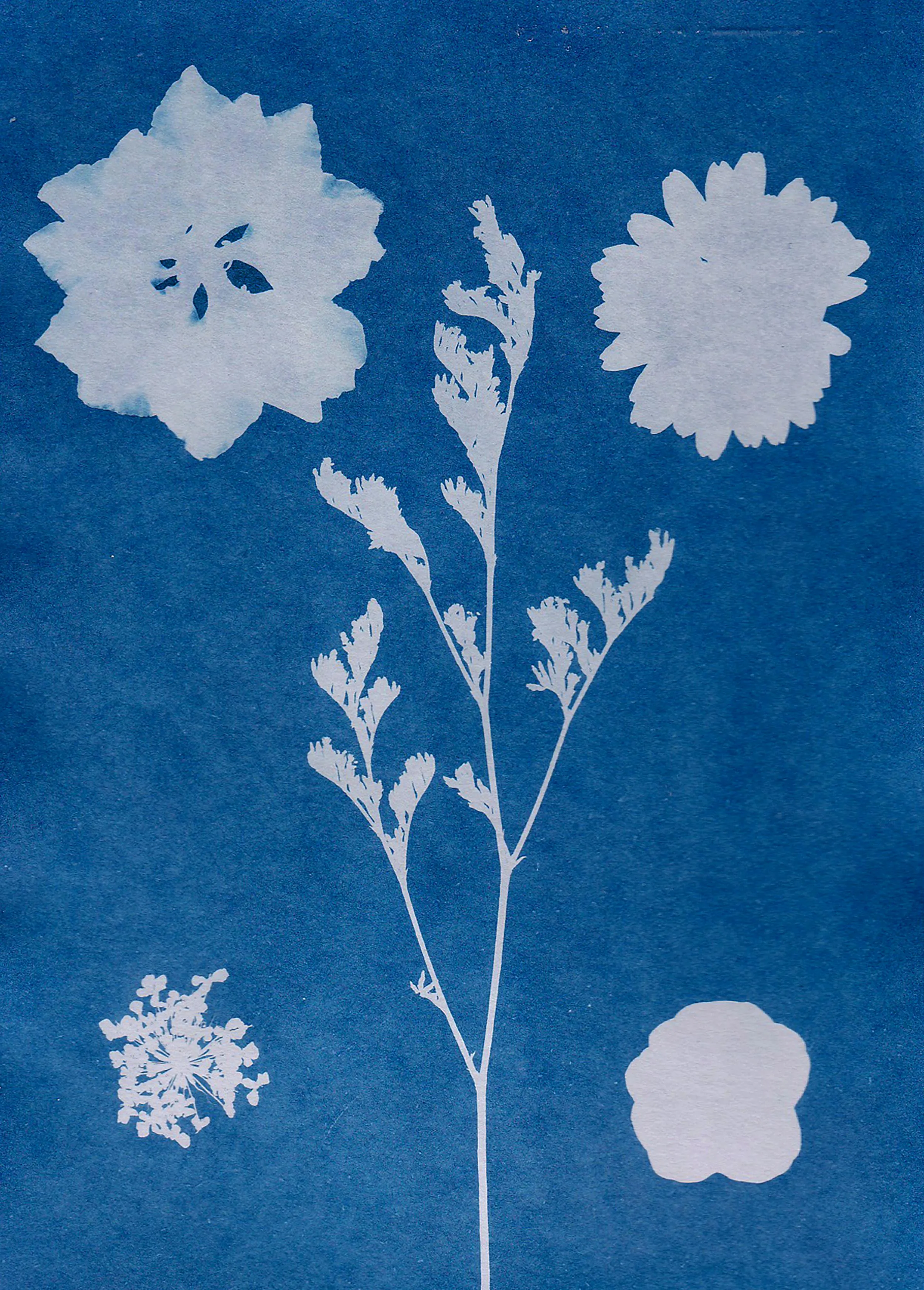
Real Artworks

Sourced from archives, libraries, and artists. Hand-drawn illustrations, vintage scientific diagrams, organic textures. Used when conveying warmth, humanity, and the story behind the technology.

About pages · Blog posts · Team content

Treated photo

Atmospheric & Subtle

Treated Photos

Photography desaturated and blended over brand colors. Creates depth and atmosphere without competing with content. The photo becomes texture, not subject.

Hero backgrounds · Section dividers · Motion

Digital & Technical

Bold Graphics

Clean geometric shapes, solid color fills, precise outlines. Minimal iconography with consistent stroke weights. Used when demonstrating capability and precision.

Product UI · Feature diagrams · CTAs

Transformed work is yours, but redistributing stock photos usually requires an active subscription. Public domain and Creative Commons are great, just verify the source.

Type

Specimens

Primary

Bricolage Grotesque

Aa

Display / 500

ABCDEFGHIJKLMNOPQRSTUVWXYZ

abcdefghijklmnopqrstuvwxyz

0123456789

Secondary

Inter

Aa

Body / 400

ABCDEFGHIJKLMNOPQRSTUVWXYZ

abcdefghijklmnopqrstuvwxyz

0123456789